The Design
A CALMING PALETTE
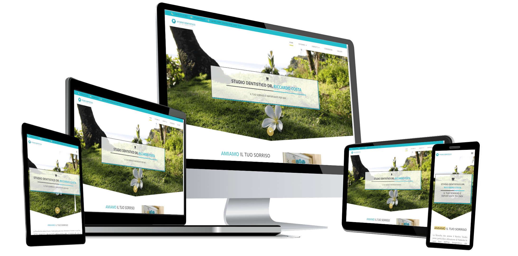
The website has a calming colour palette: white, light sea green and highlights in a gold-tone.We picked the light sea green because of its meaning of balance, calmness and clarity, which seemed to fit a dental practice.To contrast the blue colour, we picked a tone of gold, which in colour psychology means quality, value and elegance - which is also a complementary colour to the blue shade.We also created a white background to compliment the colours above and create a feeling of cleanliness and freshness.We aimed to create an aura of calm, clean and freshness.
AN ATTRACTIVE TYPOGRAPHY
We decided to pick a single sans serif font for this design: Roboto.This font might seem very mechanical and geometric, but at the same time, it is also friendly and open with its curves.This helps us convey a professional and friendly atmosphere.