The Design
A PROFESSIONAL PALETTE
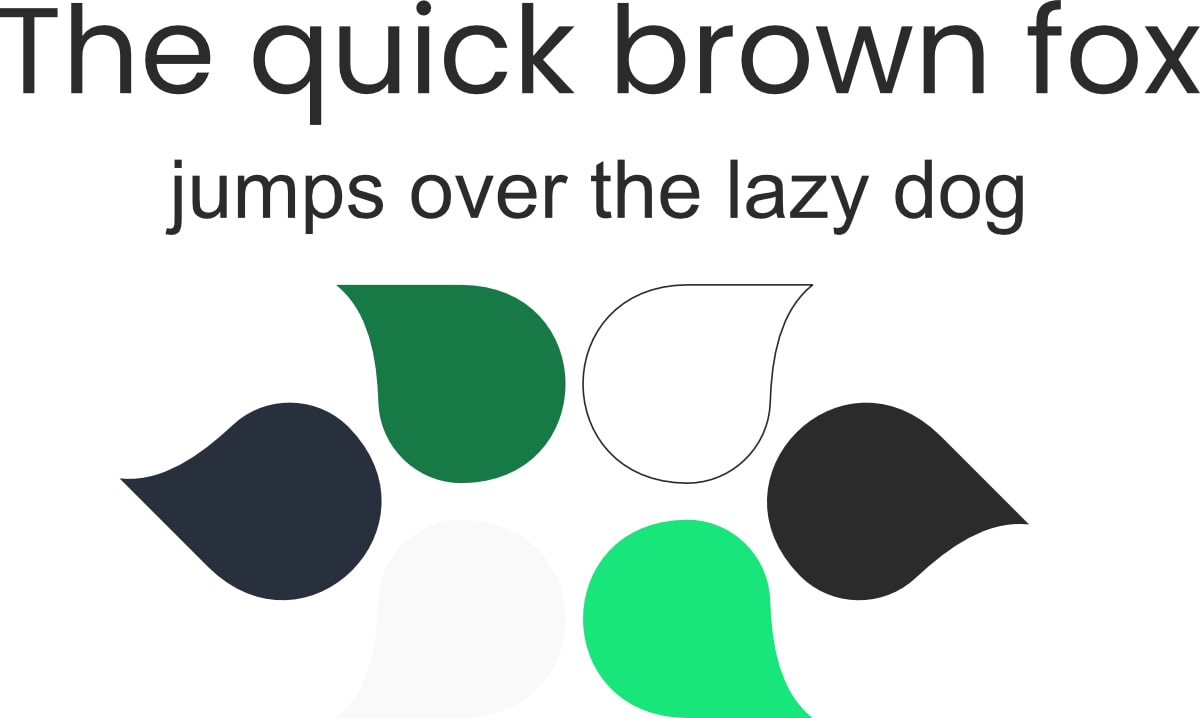
The website has a very harmonious colour palette consisting of white, green and shades of grey and black. We got inspired by the already existing logo of NUOVA TELCOMATIC S.a.s. and created a complementary palette.
We chose white as the background for its neutrality and to make the green and greys pop out. The shade of emerald green used in the Telcomatic logo is very calming, projects an aura of success and is associated with electrical products.
We complemented the grey with shades of grey and black, which communicate industry, practicality and power.
AN ELEGANT TYPOGRAPHY
We decided to create the whole page with a single font in different weights: Poppins. It is a clean and modern font made out of circular shapes. Poppins helps us convey the message of being approachable and friendly, but at the same time future-oriented.